Apple's corporate identity marks a before and after in the history of branding of computer products. Thanks to Steve Jobs, computers and other technology products showed an unfamiliar face.
 Apple made the design and functionality exquisitely sewn together, to offer clean and advanced products that changed our understanding of the technology.
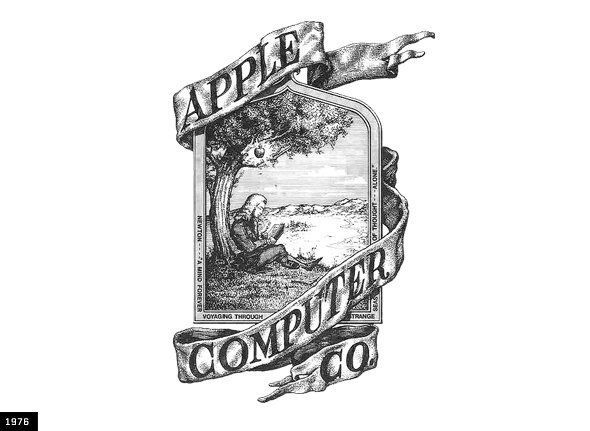
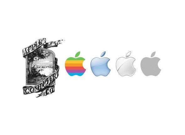
It all started in 1976. That was when the first Apple logo, designed by Ronald Wayne, who is sometimes named as a third co-founder is designed. The logo shows Isaac Newton sitting under a tree and on it, a bright apple pointed to discard. In the context we read "Newton ... A Mind Forever Voyaging Through Strange Seas of Thought ... .alone" (something like:. Newton ... a mind always traveling through strange seas of thought ... only).
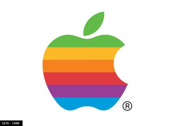
Fortunately, the logo above named only lasted a year before Steve Jobs commissioned graphic designer Rob Janoff to redesign the logo into something more modern. Janoff never imagined that the logo would be one of the most recognizable and iconic history.
According to the designer, the bite of the apple was included for the simple reason of being able to identify the icon with an apple and not a tomato. In addition, a funny pun occurs: bite (bite) / byte, an apparent reference to the technological nature of the company.
By then the logo using the colors of the rainbow inside. It is rumored that Steve Jobs insisted on using this colorful character to "humanize" the company. In addition, directly refers to its innovative color technology. Janoff said that the strange arrangement of colors was not due to any particular reason except the fact that green should be up, because that's where the leaf was.
This logo remained active until late 1998 when Jobs returned to Apple and insisted further simplify eliminating all traces of the rainbow to welcome "the Jonathan Ive was" less is more.
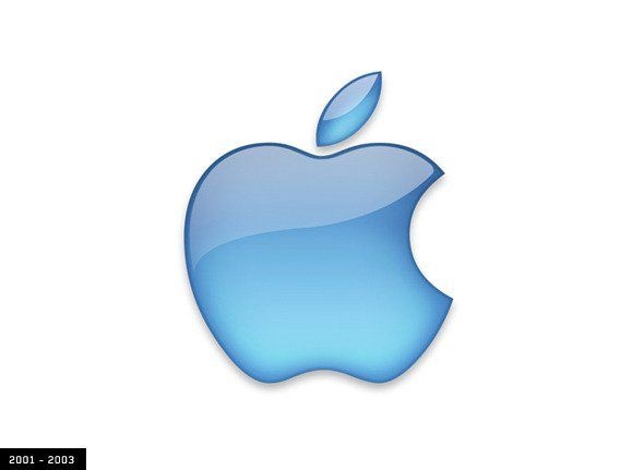
At this stage we could see several versions of monochrome logo. From 2001 to 2003 the "aqueous" version you see above was used:
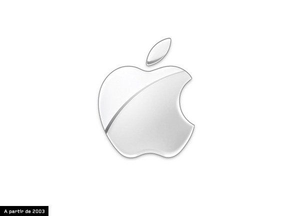
Since 2003 a more crystalline version is used.
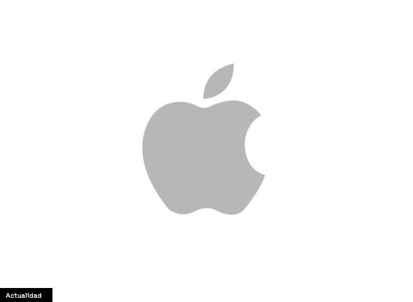
Today, the Apple logo has been further simplified by eliminating any effects of brightness or reflection, leaving a completely flat gray. Note that the apple shape remains unchanged since its creation in 1976.
At present there is a logo censorship in places like Venezuela, this logo is prohibited because they associate it with capitalism and innovation in mass. If wearing a team or accessory with this logo, the authorities often decomisarlo, so we recommend you cover it with a pegantina.